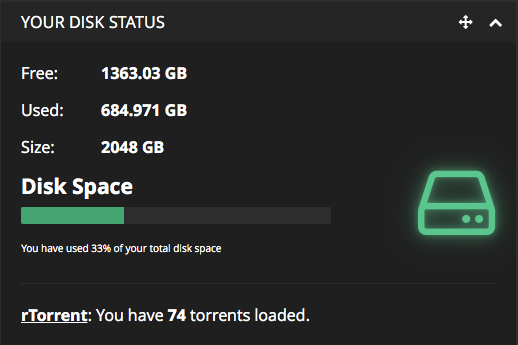
Little change of disk_data widget

Hey,

Today i made a little change of the disk_data widget. I think this way is a little cleaner than actually.
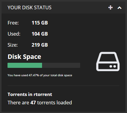
Since I use rTorrent, this example only shows it. But Deluge is obviously taken care of as well :slight_smile:

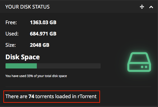
Note : the red rectangle is just for the photo :smiley:

What do you think about it?

All the languages files are ready for this change.

Regards

Hmm, not sure what I think about this. While it’s cleaner, it’s less clear. The client name is no longer the first thing a user sees and the client is not bold.

Maybe something like this would work better, while being shorter than it is currently:
rtorrent: There are 253 torrents loaded.

So, tell me if you prefer one of these solutions :

And of course, all these examples are the same with Deluge. I just don’t have Deluge on my setup.

1 Like

I’m a fan of the second example/image you posted. @JMSolo has the final say.

I am not entirely certain what this aims to achieve as it is already fairly clear on the current widget. I don’t think this method is any more clear than what is already headlined on a ‘per client’ aesthetic.

I believe @tomcdj71 is aiming to make these one line text, instead of two line.

Well, I see no harm in this assuming this is an issue for several members.

No issues for me, i don’t hate the actual design. I made it for fun and I liked the rendering :grin:

Would you like to submit a pull request for this on the Github Repo?

I can’t before June, 23 at least because I’m currently not at home